

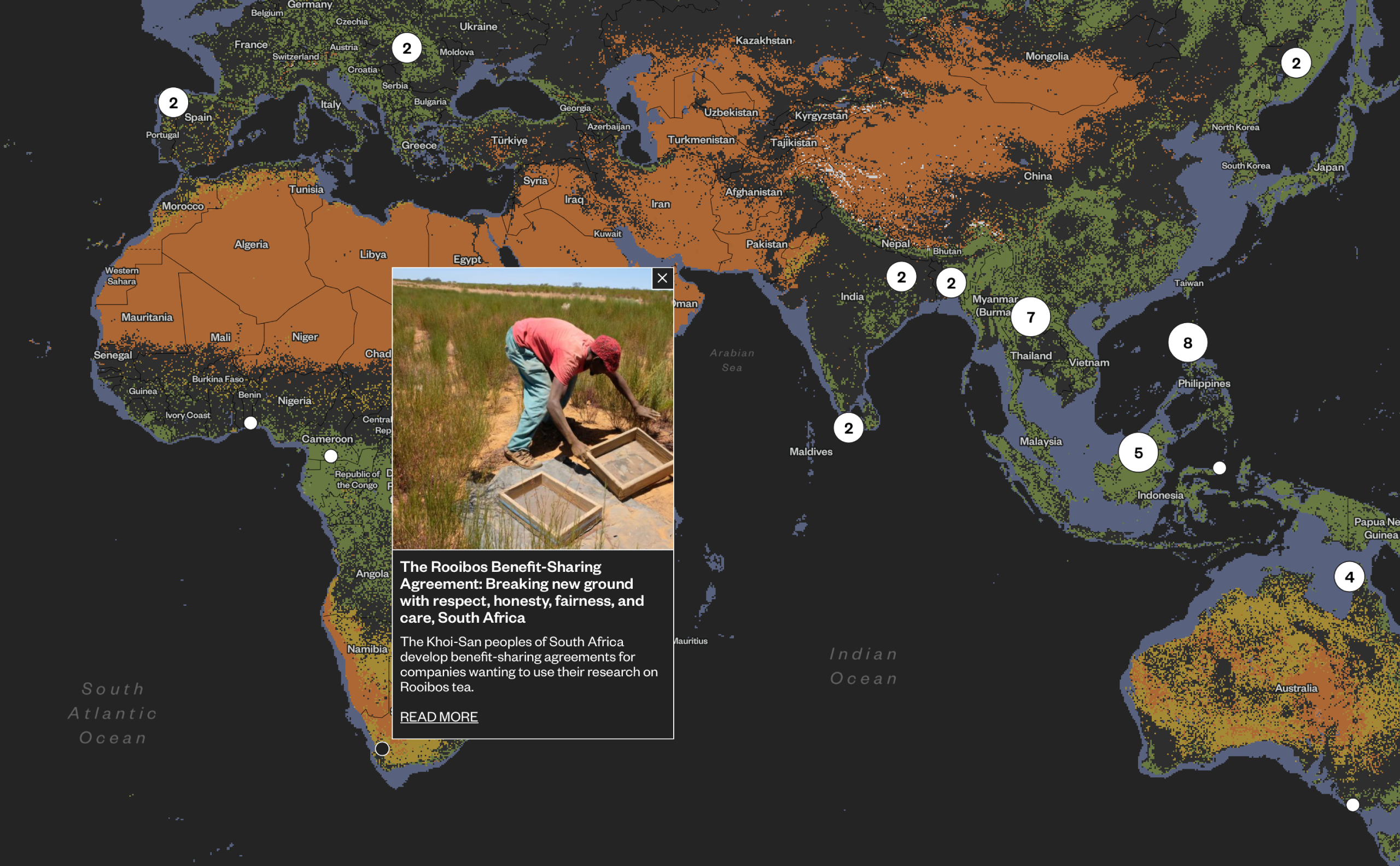
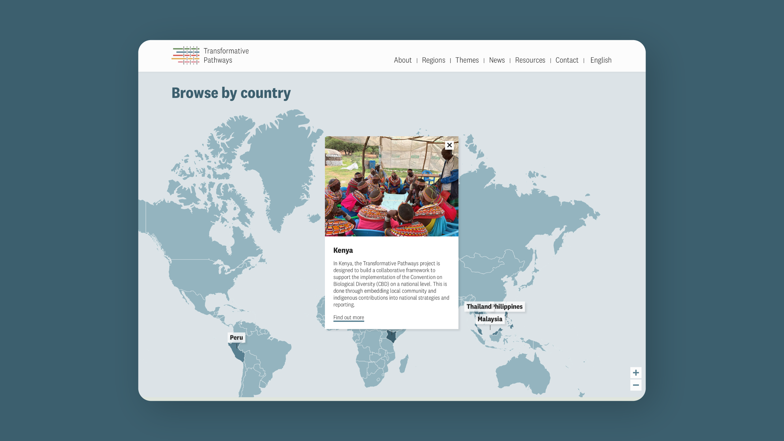
Each example below is an interactive map we designed and built to plot the data behind a project:
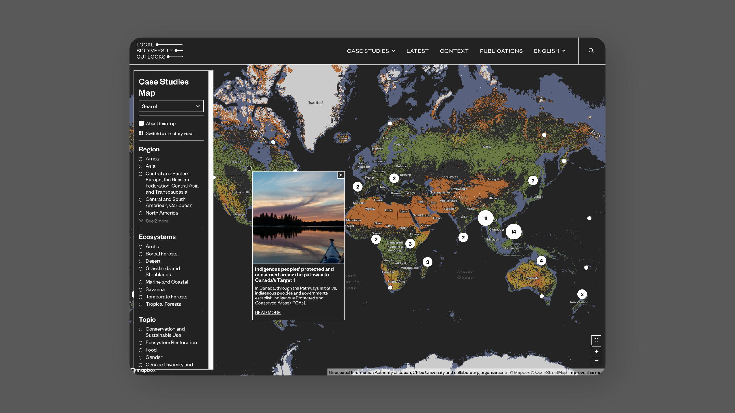
- Local Biodiversity Outlooks helps users locate ecosystems and the indigenous-led conservation projects taking place within them.
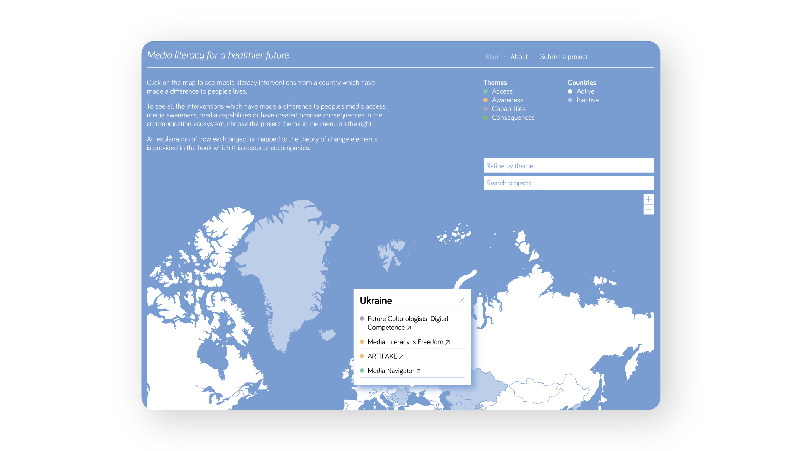
- Media literacy for a healthier future lets users click a country to see related media literacy work making a difference to people’s lives.
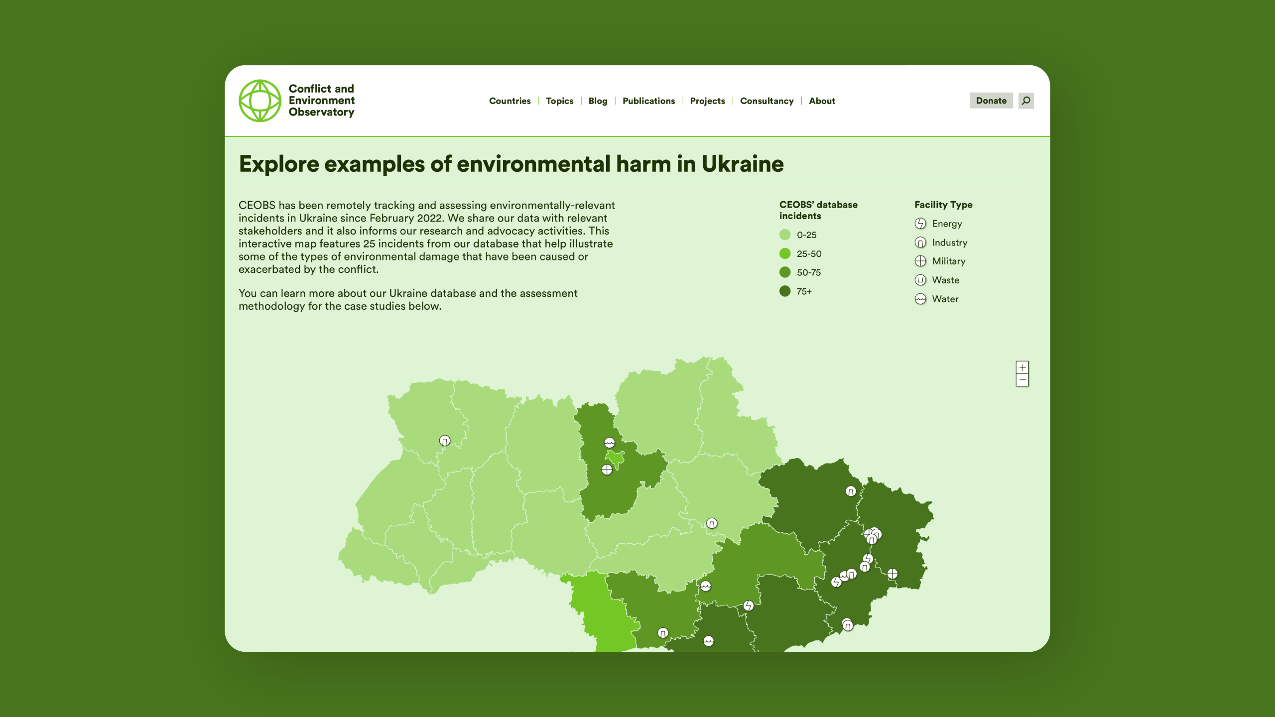
- Our Ukraine map traces emissions from military activity and the environmental damage caused by conflict, making the hidden effects of the war easy to grasp.
In each case, we shaped map appearance, user interface design, interactions, and the code that brings it all together, turning complex data into experiences people can take part in and understand.
Click any image below to visit the finished project.
the humAIne project
the humAIne project
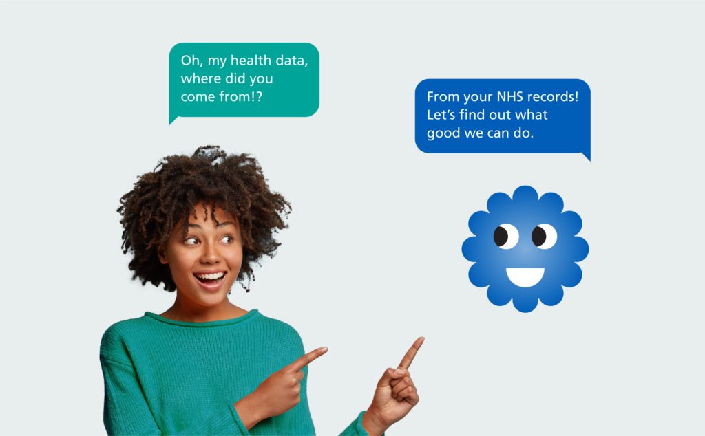
NHS Secure Data Environment
NHS Secure Data Environment

DigiAdGood